Scroll to Style jQuery Plugin • Documentation
Updated: 07/08/2017
Version: 3.1.0
By: MASSCODE
URL: http://codecanyon.net/user/yurik417/portfolio
Email: limasscode@gmail.com
Introducing
Description
scrollToStyle is a versatile tool that lets you manage CSS properties of elements using the page scroll.
You will be able to compel the elements move, change their size, color, opacity, background and many other properties.
Using scrollToStyle plugin, you can create incredible animations to visualize various data, apply effects to images and create stunning 3D graphics.
You can also implement sprite animation.
And the most important thing is that in the animation will be involved the user using mouse scroll.
Features
- Management absolutely all the properties of a numeric value
- Browser Support depends only on selected properties
- It manages multiple properties of the same element
- Management fractional property values and control the number of decimal places
- Fixing of the screen during an animation
- Animation Torque control
- A lot of helper classes
- Very small weight of plugin
- Large and detailed documentation
License
All parts of this plugin: CSS and javascript codes are licensed according to the license purchased from Envato.
Read more about licensing here: http://codecanyon.net/licenses
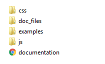
Purchased Archive Structure
- Plugin styles file is in the "css" folder
- Plugin scripts file is in the "js" folder
Files Connection
1. The style file. Used for the decoration of all the elements of a plugin. View details
2. Javascript library jQuery View details
3. The main plugin file View details
<head>
		<link rel="stylesheet" href="css/scrollToStyle.css">
		<script src="http://code.jquery.com/jquery-latest.js"></script>
		<script src="js/jquery.scrollToStyle.js"></script>
	</head>
HTML Structure
About the appointment of all mandatory elements, see the section "foundation"
<body>

		<!-- ...Previous content... -->

		<div data-pause="1000" class="sts-section">
			<div data-persent="0,100" data-style="transform:rotateX([0,360]deg)"></div>
		</div>

		<!-- ...Next content... -->

	</body>
Plugin Initialization
Plugin initialization is hidden and does not require the user of the call.
To interact plug-in with the elements need only assign these elements the desired attributes.
CSS Structure
I'm using one CSS files scrollToStyle.css (css/scrollToStyle.css) in this plugin. It contains styles which are responsible for the correct plugin work.
JavaScript
To use the plugin you must import two files of javascript:
1. jQuery (js/jquery-X.X.X.min.js)
2. jquery.scrollToStyle.js (js/jquery.scrollToStyle.js)
1. jQuery is a Javascript library that greatly reduces the amount of code that you must write. If you imported this version of jQuery or any other, it is not necessary to import it for the second time
2. The main plugin code.
Quick Start
To add a plug-in to the site you need to walk a only 3 steps:
1. Include all the necessary files to the page of the site.
2. Place all necessary files on your server using ftp
3. Add HTML code
Full code of examples, see in "Examples"
API
"sts-section"
1. This class name "sts-section" is assigned to all the parent elements inside of which will be animation of child elements.
2. The size of this element is equal to the size of the viewport.
3. Without this element, the plugin will not work correctly!
Source
<!DOCTYPE html>
	<html>
	<head>
		<script src="http://code.jquery.com/jquery-latest.js"></script>
		<link rel="stylesheet" href="css/scrollToStyle.css">
		<script src="js/jquery.scrollToStyle.js"></script>
	</head>
	<body>

		<!-- ...Previous content... -->

		<div class="sts-section" data-pause="1000">

			<!-- ... In this place will be animated elements ... -->

		</div>

		<!-- ...Next content... -->

	</body>
	</html>
"data-pause"
1. This attribute is mandatory.
2. The value of the "data-pause" attribute sets number of scroll pixels, during which the target screen will fixedly to stand still.
This pause is the main period of time for animation playback.
3. This attribute must be specified for an element with the class name "sts-section".
<div data-pause="1000" class="sts-section">
		<div class="custom-item"></div>
	</div>
4. This value can not be negative.
5. Valid values:
- only number, e.g. "1000" (This value is perceived as a value in pixels)
- value in pixels, e.g. "1000px" (This is value in pixels)
- value in viewport height units, e.g. "100vh" (This is the percentage of the height of the viewport)
- "auto" (The height is calculated automatically depending on the height of the content, according to the formula: data-pause = Content Height - Window Height)
View Demo
<!DOCTYPE html>
	<html>
	<head>
		<script src="http://code.jquery.com/jquery-latest.js"></script>
		<link rel="stylesheet" href="css/scrollToStyle.css">
		<script src="js/jquery.scrollToStyle.js"></script>
	</head>
	<body>

		<!-- ...Previous content... -->

		<div data-pause="500" class="sts-section">
			<div class="custom-screen-item"></div>
		</div>

		<div data-pause="1000" class="sts-section">
			<div class="custom-screen-item"></div>
		</div>

		<div data-pause="2000" class="sts-section">
			<div class="custom-screen-item"></div>
		</div>

		<!-- ...Next content... -->

	</body>
	</html>
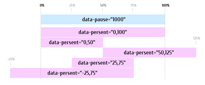
"data-persent"
1. This attribute can be specified for any item that you want to animate.
2. The value of the "data-persent" attribute sets persent range, which determines how much of the time from the previously set time delay, the animation will be played.
It depends on the value of attribute "data-pause"
3. This attribute is always used together with the "data-style" attribute
<div data-persent="0,100" data-style="transform:rotateX([0,360]deg)"></div>
4. This value can be negative.
View Demo
<!DOCTYPE html>
	<html>
	<head>
		<script src="http://code.jquery.com/jquery-latest.js"></script>
		<link rel="stylesheet" href="css/scrollToStyle.css">
		<script src="js/jquery.scrollToStyle.js"></script>
	</head>
	<body>

		<!-- ...Previous content... -->

		<div data-pause="1000" class="sts-section">
			<div data-persent="-100,200" data-style="transform:rotateX([-360,720]deg)"></div>
			<div data-persent="0,100" data-style="transform:rotateX([0,360]deg)"></div>
			<div data-persent="0,50" data-style="transform:rotateX([0,360]deg)"></div>
			<div data-persent="50,100" data-style="transform:rotateX([0,360]deg)"></div>
			<div data-persent="50,51" data-style="transform:rotateX([0,360]deg)"></div>
			<div data-persent="-1,0" data-style="transform:translateY([300,0]px); opacity:[0,1];"></div>
			<div data-persent="-25,-24" data-style="transform:translateY([300,0]px); opacity:[0,1];"></div>
		</div>

		<!-- ...Next content... -->

	</body>
	</html>
"data-style"
1. Attribute "data-style" is an analogue of "style" attribute.
2. In this attribute You need specify an inline styles, that you want to animate.
3. Instead of a single value of the property is necessary to specify two (initial and final state). These values need to be written in square brackets, separated by commas.
4. This attribute is always used together with the "data-persent" attribute
For example, we create transformation for "font-size" property from 30px to 100px:
<div data-persent="0,100" data-style="font-size:[30,100]px">Any Text</div>
View Demo
<!DOCTYPE html>
	<html>
	<head>
		<script src="http://code.jquery.com/jquery-latest.js"></script>
		<link rel="stylesheet" href="css/scrollToStyle.css">
		<script src="js/jquery.scrollToStyle.js"></script>
	</head>
	<body>

		<!-- ...Previous content... -->
		<div data-pause="1000" class="sts-section">
			<div data-persent="0,100" data-style="font-size:[30,100]px">S</div>
			<div data-persent="0,100" data-style="font-size:[200,50]px">T</div>
			<div data-persent="0,100" data-style="font-size:[100,320]px">S</div>
		</div>
		<!-- ...Next content... -->

	</body>
	</html>
"sts-counter"
This class name "sts-counter" is assigned to the element in which you want to display an animation of counter (increase or decrease in the number depending on the scrolling).
View Demo
<!DOCTYPE html>
	<html>
	<head>
		<script src="http://code.jquery.com/jquery-latest.js"></script>
		<link rel="stylesheet" href="css/scrollToStyle.css">
		<script src="js/jquery.scrollToStyle.js"></script>
	</head>
	<body>

		<!-- ...Previous content... -->

		<div data-pause="1000" class="sts-section">
			<div class="sts_counter" data-persent="0,100" data-style="$[0,1000]"></div>
		</div>

		<!-- ...Next content... -->

	</body>
	</html>
"data-decimal"
Attribute "data-decimal" specifies the number of digits after the decimal point for animated values.
For example, we create animation for "opacity" property from 0 to 1.
For this we specify the attribute "data-decimal" with a value of 2.
Thus we create an animation from 0.00 to 1.00:
<div data-decimal="2" data-persent="0,100" data-style="opacity:[0,1]"></div>
View Demo
<!DOCTYPE html>
	<html>
	<head>
		<script src="http://code.jquery.com/jquery-latest.js"></script>
		<link rel="stylesheet" href="css/scrollToStyle.css">
		<script src="js/jquery.scrollToStyle.js"></script>
	</head>
	<body>

		<!-- ...Previous content... -->

		<div data-pause="2000" class="sts-section">
			<img class="custom-pos-center custom-opacity-pic" src="pic/map.png">
			<img data-persent="0,25" data-style="opacity:[0,1]" data-decimal="2" src="pic/map_magenta.png">
			<img data-persent="26,50" data-style="opacity:[0,1]" data-decimal="2" src="pic/map_blue.png">
			<img data-persent="51,75" data-style="opacity:[0,1]" data-decimal="2" src="pic/map_green.png">
		</div>

		<!-- ...Next content... -->

	</body>
	</html>
"sts-fixed"
For correctly work of the plugin in a document generated several additional elements. In consequence of that fixed positioning stops working.
To fix this, for the elements with fixed positioning is necessary to add the class name "sts-fixed"
Attention! The class name "sts-fixed" does not fix the elements! And just only corrects them behavior.
View Demo
<!DOCTYPE html>
	<html>
	<head>
		<script src="http://code.jquery.com/jquery-latest.js"></script>
		<link rel="stylesheet" href="css/scrollToStyle.css">
		<script src="js/jquery.scrollToStyle.js"></script>
	</head>
	<body>

		<div class="sts-fixed" style="position:fixed; top:40px; left:40px">Have class name "sts-fixed"</div>
		<!-- ...Previous content... -->
		<div data-pause="1000" class="sts-section sts-perspective-1000">
			<div data-persent="0,100" data-style="transform:rotateX([0,360]deg) translateZ(0)"></div>
		</div>
		<!-- ...Next content... -->

	</body>
	</html>
"data-minwidth"
Attribute "data-minwidth" sets the minimum value of the width of the screen at which the plugin works.
If the width of the screen is less than the specified, then the plugin is disabled
Default Value: 0
View Demo
<!DOCTYPE html>
	<html>
	<head>
		<script src="http://code.jquery.com/jquery-latest.js"></script>
		<link rel="stylesheet" href="css/scrollToStyle.css">
		<script src="js/jquery.scrollToStyle.js"></script>
	</head>
	<body>

		<!-- ...Previous content... -->

		<div data-minwidth="980" data-pause="2000" class="sts-section">
			<div data-persent="0,100" data-style="left:[50,25]%;"></div>
		</div>

		<!-- ...Next content... -->

	</body>
	</html>
"sts-frame-wrap"
1. This class name "sts-frame-wrap" is assigned to the parent element of sprite image.
2. Together with this class name, this element must contain a width value.
This width will set the size of the object to be animated.
The width can be specified in any available units.
View Demo
<!DOCTYPE html>
	<html>
	<head>
		<script src="http://code.jquery.com/jquery-latest.js"></script>
		<link rel="stylesheet" href="css/scrollToStyle.css">
		<script src="js/jquery.scrollToStyle.js"></script>
	</head>
	<body>

		<!-- ...Previous content... -->

		<div data-pause="100vh" class="sts-section">

			<div class="sts-frame-wrap" style="width:200px;">

				<img src="sprite.png" data-persent="0,100" data-frame="1,50" data-cols="10" data-rows="5">

			</div>

		</div>

		<!-- ...Next content... -->

	</body>
	</html>
"data-frame"
1. This attribute is assigned to the sprite image or canvas elements
2. Sets the start and end frame of the animation
For example, we create sprite animation from 1 to 50 frames:
<img src="sprite.png" data-persent="0,100" data-frame="1,50" data-cols="10" data-rows="5">
<canvas data-src="sprite.png" data-persent="0,100" data-frame="1,50" data-cols="10" data-rows="5"></canvas>
View Demo
<!DOCTYPE html>
	<html>
	<head>
		<script src="http://code.jquery.com/jquery-latest.js"></script>
		<link rel="stylesheet" href="css/scrollToStyle.css">
		<script src="js/jquery.scrollToStyle.js"></script>
	</head>
	<body>

		<!-- ...Previous content... -->

		<div data-pause="100vh" class="sts-section">

			<div class="sts-frame-wrap" style="width:200px;">

				<img src="sprite.png" data-persent="0,100" data-frame="1,50" data-cols="10" data-rows="5">

			</div>

		</div>

		<!-- ...Next content... -->

	</body>
	</html>
"data-cols"
1. This attribute is assigned to the sprite image or canvas elements
2. Sets the number of frames horizontally in the sprite
View Demo
<!DOCTYPE html>
	<html>
	<head>
		<script src="http://code.jquery.com/jquery-latest.js"></script>
		<link rel="stylesheet" href="css/scrollToStyle.css">
		<script src="js/jquery.scrollToStyle.js"></script>
	</head>
	<body>

		<!-- ...Previous content... -->

		<div data-pause="100vh" class="sts-section">

			<div class="sts-frame-wrap" style="width:200px;">

				<img src="sprite.png" data-persent="0,100" data-frame="1,50" data-cols="10" data-rows="5">

			</div>

		</div>

		<!-- ...Next content... -->

	</body>
	</html>
"data-rows"
1. This attribute is assigned to the sprite image or canvas elements
2. Sets the number of frames vertically in the sprite
View Demo
<!DOCTYPE html>
	<html>
	<head>
		<script src="http://code.jquery.com/jquery-latest.js"></script>
		<link rel="stylesheet" href="css/scrollToStyle.css">
		<script src="js/jquery.scrollToStyle.js"></script>
	</head>
	<body>

		<!-- ...Previous content... -->

		<div data-pause="100vh" class="sts-section">

			<div class="sts-frame-wrap" style="width:200px;">

				<img src="sprite.png" data-persent="0,100" data-frame="1,50" data-cols="10" data-rows="5">

			</div>

		</div>

		<!-- ...Next content... -->

	</body>
	</html>
Examples: Sprite Animation
CSS_Sprite_Animation
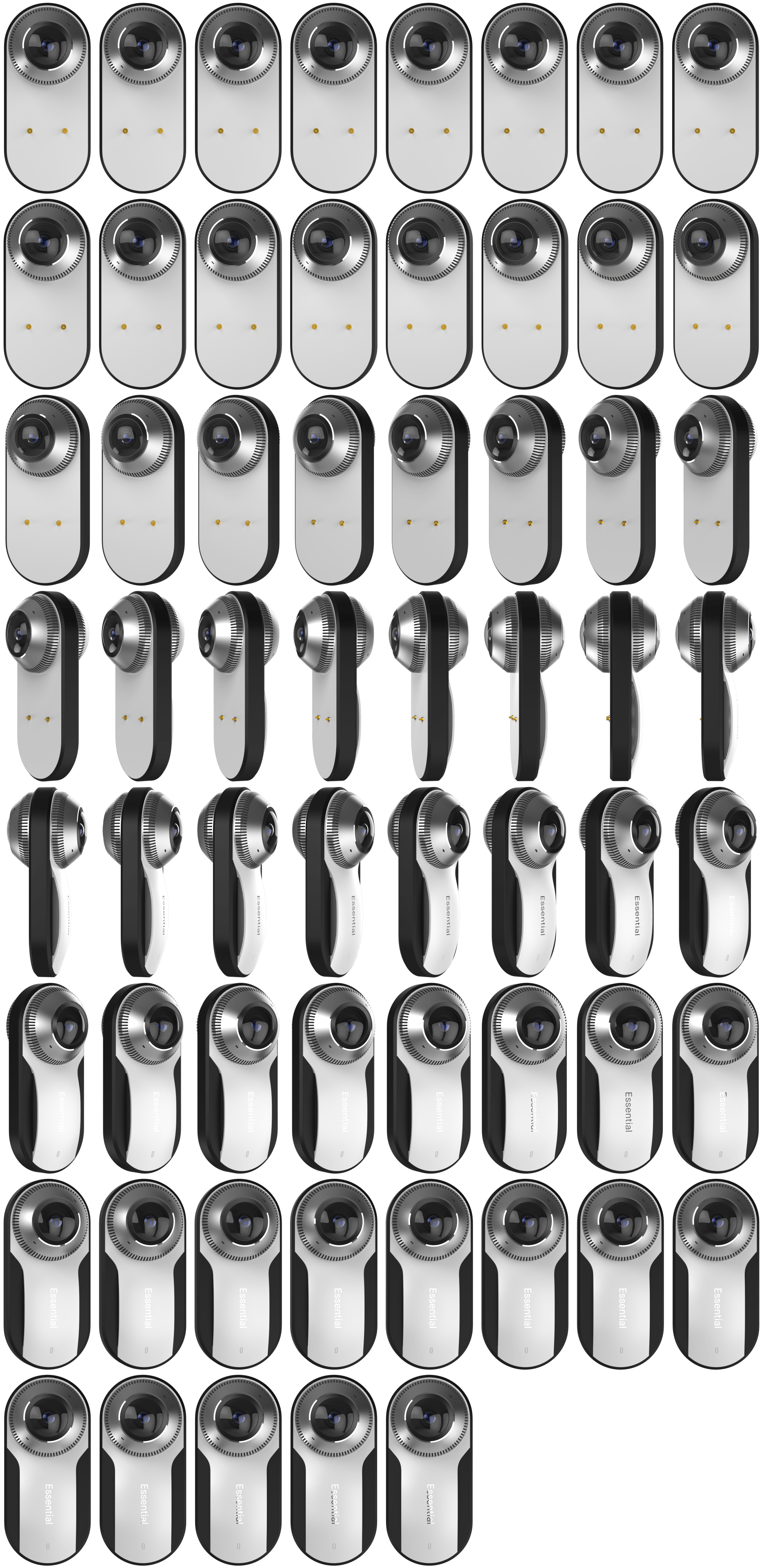
View Demo
<!DOCTYPE html>
	<html>
	<head>
		<script src="http://code.jquery.com/jquery-latest.js"></script>
		<link rel="stylesheet" href="css/scrollToStyle.css">
		<script src="js/jquery.scrollToStyle.js"></script>
	</head>
	<body>

		<!-- ...Previous content... -->
		<div data-pause="100vh" class="sts-section">

			<div class="sts-frame-wrap" style="width:11vw;">
				<img src="cam_sprite.png" data-persent="0,100" data-frame="1,61" data-cols="8" data-rows="8">
			</div>

		</div>
		<!-- ...Next content... -->

	</body>
	</html>
Canvas Sprite Animation
View Demo
<!DOCTYPE html>
	<html>
	<head>
		<script src="http://code.jquery.com/jquery-latest.js"></script>
		<link rel="stylesheet" href="css/scrollToStyle.css">
		<script src="js/jquery.scrollToStyle.js"></script>
	</head>
	<body>

		<!-- ...Previous content... -->
		<div data-pause="100vh" class="sts-section">

			<div class="sts-frame-wrap" style="width:100%; max-width:600px">
				<canvas data-src="pms_ani2_sprite.jpg" data-persent="0,100" data-frame="1,46" data-cols="1" data-rows="46"></canvas>
			</div>

		</div>
		<!-- ...Next content... -->

	</body>
	</html>
Examples: Text
Text Color
For color control is necessary to use an RGB or RGBA color model.
For example, we create transformation from rgb(12,221,0) color to rgb(126,65,255):
color:rgb([12,126],[221,65],[0,255]); /*From rgb(12,221,0) to rgb(126,65,255)*/
View Demo
<!DOCTYPE html>
	<html>
	<head>
		<script src="http://code.jquery.com/jquery-latest.js"></script>
		<link rel="stylesheet" href="css/scrollToStyle.css">
		<script src="js/jquery.scrollToStyle.js"></script>
	</head>
	<body>

		<!-- ...Previous content... -->
		<div data-pause="1000" class="sts-section">
			<div data-persent="0,100" data-style="color:rgb([0,255],[198,0],0);">S</div>
			<div data-persent="0,100" data-style="color:rgb([12,126],[221,65],[0,255]);">T</div>
			<div data-persent="0,100" data-style="color:rgb([0,255],[12,154],[12,126]);">S</div>
		</div>
		<!-- ...Next content... -->

	</body>
	</html>
Font Size
For size control you must use the "font-size" parameter.
For example, we create transformation from 30px to 100px:
font-size:[30,100]px; /*From 30px to 100px*/
View Demo
<!DOCTYPE html>
	<html>
	<head>
		<script src="http://code.jquery.com/jquery-latest.js"></script>
		<link rel="stylesheet" href="css/scrollToStyle.css">
		<script src="js/jquery.scrollToStyle.js"></script>
	</head>
	<body>

		<!-- ...Previous content... -->
		<div data-pause="1000" class="sts-section">
			<div data-persent="0,100" data-style="font-size:[30,100]px">S</div>
			<div data-persent="0,100" data-style="font-size:[200,50]px">T</div>
			<div data-persent="0,100" data-style="font-size:[100,320]px">S</div>
		</div>
		<!-- ...Next content... -->

	</body>
	</html>
Letter Spacing
For Letter Spacing control you must use the "letter-spacing" parameter.
For example, we create transformation from 0px to 70px:
letter-spacing:[0,70]px; /*From 0px to 70px*/
View Demo
<!DOCTYPE html>
	<html>
	<head>
		<script src="http://code.jquery.com/jquery-latest.js"></script>
		<link rel="stylesheet" href="css/scrollToStyle.css">
		<script src="js/jquery.scrollToStyle.js"></script>
	</head>
	<body>

		<!-- ...Previous content... -->
		<div data-pause="1000" class="sts-section">
			<div data-persent="0,100" data-style="letter-spacing:[0,70]px;">SPACING</div>
		</div>
		<!-- ...Next content... -->

	</body>
	</html>
Text Shadow
For Text Shadow control you must use the "text-shadow" parameter.
For example, we create transformation for shadow blur from 20px to 0px:
text-shadow: 0 0 [20,0]px #000; /*From 20px to 0px*/
View Demo
<!DOCTYPE html>
	<html>
	<head>
		<script src="http://code.jquery.com/jquery-latest.js"></script>
		<link rel="stylesheet" href="css/scrollToStyle.css">
		<script src="js/jquery.scrollToStyle.js"></script>
	</head>
	<body>

		<!-- ...Previous content... -->
		<div data-pause="1000" class="sts-section">
			<div data-persent="0,100" data-style="text-shadow: 0 [100,0]px [20,0]px rgba(0,0,0,0.5);">Any Text</div>
		</div>
		<!-- ...Next content... -->

	</body>
	</html>
Examples: Background
Background Color
For Background Color control is necessary to use an RGB or RGBA color model.
For example, we create transformation from rgb(255,255,0) color to rgb(255,0,0):
background-color:rgb(255,[255,0],0); /*From rgb(255,255,0) to rgb(255,0,0)*/
View Demo
<!DOCTYPE html>
	<html>
	<head>
		<script src="http://code.jquery.com/jquery-latest.js"></script>
		<link rel="stylesheet" href="css/scrollToStyle.css">
		<script src="js/jquery.scrollToStyle.js"></script>
	</head>
	<body>

		<!-- ...Previous content... -->
		<div data-pause="1000" class="sts-section">
			<div data-persent="0,100" data-style="background-color:rgb(255,[255,0],0);"></div>
		</div>
		<!-- ...Next content... -->

	</body>
	</html>
Linear Gradient
For Linear Gradient control is necessary to use an RGB or RGBA color model.
Manage is possible not only color, but also the direction of the angle
For example, we create transformation from 0 to 360 deg :
/*From 0 to 360 deg*/
	background: linear-gradient([0,360]deg, rgba(135,224,253,1) 0%, rgba(5,171,224,1) 100%);
View Demo
<!DOCTYPE html>
	<html>
	<head>
		<script src="http://code.jquery.com/jquery-latest.js"></script>
		<link rel="stylesheet" href="css/scrollToStyle.css">
		<script src="js/jquery.scrollToStyle.js"></script>
	</head>
	<body>

		<!-- ...Previous content... -->
		<div data-pause="1000" class="sts-section">
			<div data-persent="20,80" data-style="background: linear-gradient([0,360]deg, rgba([135,255],[224,93],[253,177],1) 0%, rgba([5,239],[171,1],[224,124],1) 100%);"></div>
		</div>
		<!-- ...Next content... -->

	</body>
	</html>
Radial Gradient
For Radial Gradient control is necessary to use an RGB or RGBA color model.
Manage is possible not only color, but also the control points
For example, we create transformation for gradient offset from 0 to 100 % :
/*From 0 to 100 %*/
	background: radial-gradient(ellipse at center, rgb(1365,244,253) 0%,rgb(5,171,224) [0,100]%);
View Demo
<!DOCTYPE html>
	<html>
	<head>
		<script src="http://code.jquery.com/jquery-latest.js"></script>
		<link rel="stylesheet" href="css/scrollToStyle.css">
		<script src="js/jquery.scrollToStyle.js"></script>
	</head>
	<body>

		<!-- ...Previous content... -->
		<div data-pause="1000" class="sts-section">
			<div data-persent="20,80" data-style="background: radial-gradient(ellipse at center, rgba([1365,246],[244,230],[253,180],1) 0%,rgba([5,237],[171,144],[224,23],1) [0,100]%);"></div>
		</div>
		<!-- ...Next content... -->

	</body>
	</html>
Complex Gradient
For Complex Gradient control is necessary to use an RGB or RGBA color model.
Manage is possible not only color, but also the control points and angle direction
For example, we create transformation for gradient offset two colors:
/*From 10 to 60 %*/
	background: linear-gradient(45deg, rgba(157,213,58,1) 0%,rgba(161,213,79,1) [10,60]%, rgba(128,194,23,1) [40,60]%, rgba(124,188,10,1) 100%);
View Demo
<!DOCTYPE html>
	<html>
	<head>
		<script src="http://code.jquery.com/jquery-latest.js"></script>
		<link rel="stylesheet" href="css/scrollToStyle.css">
		<script src="js/jquery.scrollToStyle.js"></script>
	</head>
	<body>

		<!-- ...Previous content... -->
		<div data-pause="1000" class="sts-section">
			<div data-persent="20,80" data-style="background: linear-gradient([-45,45]deg, rgba(157,213,58,1) 0%,rgba(161,213,79,1) [10,60]%,rgba(128,194,23,1) [40,60]%,rgba(124,188,10,1) 100%);"></div>
		</div>
		<!-- ...Next content... -->

	</body>
	</html>
Background Size
For Background Size control is necessary to use "background-size" parameter.
For example, we create transformation for background along the X axis from 100% to 200%:
/*From 100% to 200%*/
	background-size:[100,200]% auto;
View Demo
<!DOCTYPE html>
	<html>
	<head>
		<script src="http://code.jquery.com/jquery-latest.js"></script>
		<link rel="stylesheet" href="css/scrollToStyle.css">
		<script src="js/jquery.scrollToStyle.js"></script>
	</head>
	<body>

		<!-- ...Previous content... -->
		<div data-pause="1000" class="sts-section">
			<div data-persent="20,80" data-style="background-size:[100,200]% auto"></div>
		</div>
		<!-- ...Next content... -->

	</body>
	</html>
Background Position
For Background Position control is necessary to use "background-position" parameter.
For example, we create transformation for background position along the X axis from 0% to 100%:
/*From 0% to 100%*/
	background-position:[0, 100]% 50%;
View Demo
<!DOCTYPE html>
	<html>
	<head>
		<script src="http://code.jquery.com/jquery-latest.js"></script>
		<link rel="stylesheet" href="css/scrollToStyle.css">
		<script src="js/jquery.scrollToStyle.js"></script>
	</head>
	<body>

		<!-- ...Previous content... -->
		<div data-pause="1000" class="sts-section">
			<div data-persent="20,80" data-style="background-position:[0, 100]% 50%">Horizontal</div>
		</div>
		<div data-pause="1000" class="sts-section">
			<div data-persent="20,80" data-style="background-position:50% [0, 100]%">Vertical</div>
		</div>
		<!-- ...Next content... -->

	</body>
	</html>
Examples: Filters
Blur
For Blur control is necessary to use "filter" parameter.
For example, we create transformation for Blur effect from 50px to 0px:
/*From 50px to 0px*/
	filter: blur([50,0]px);
View Demo
<!DOCTYPE html>
	<html>
	<head>
		<script src="http://code.jquery.com/jquery-latest.js"></script>
		<link rel="stylesheet" href="css/scrollToStyle.css">
		<script src="js/jquery.scrollToStyle.js"></script>
	</head>
	<body>

		<!-- ...Previous content... -->
		<div data-pause="1000" class="sts-section">
			<div data-persent="20,80" data-style="filter: blur([50,0]px)"></div>
		</div>
		<!-- ...Next content... -->

	</body>
	</html>
Brightness
For Brightness control is necessary to use "filter" parameter.
To work with fractional values, use the "data-decimal" attribute with a value of 1 or 2.
For example, we create transformation for Brightness effect from 0.1 to 3:
/*from 0.1 to 3*/
	filter: brightness([0.1,3]);
View Demo
<!DOCTYPE html>
	<html>
	<head>
		<script src="http://code.jquery.com/jquery-latest.js"></script>
		<link rel="stylesheet" href="css/scrollToStyle.css">
		<script src="js/jquery.scrollToStyle.js"></script>
	</head>
	<body>

		<!-- ...Previous content... -->
		<div data-pause="1000" class="sts-section">
			<div data-persent="20,80" data-decimal="2" data-style="filter: brightness([0.1,3])"></div>
		</div>
		<!-- ...Next content... -->

	</body>
	</html>
Contrast
For Contrast control is necessary to use "filter" parameter.
For example, we create transformation for Contrast effect from 50% to 200%:
/*from 50% to 200%*/
	filter: contrast([50,200]%);
View Demo
<!DOCTYPE html>
	<html>
	<head>
		<script src="http://code.jquery.com/jquery-latest.js"></script>
		<link rel="stylesheet" href="css/scrollToStyle.css">
		<script src="js/jquery.scrollToStyle.js"></script>
	</head>
	<body>

		<!-- ...Previous content... -->
		<div data-pause="1000" class="sts-section">
			<div data-persent="20,80" data-style="filter: contrast([50,200]%)"></div>
		</div>
		<!-- ...Next content... -->

	</body>
	</html>
Grayscale
For Grayscale control is necessary to use "filter" parameter.
To work with fractional values, use the "data-decimal" attribute with a value of 1 or 2.
For example, we create transformation for Contrast effect from 1 to 0:
/*from 1 to 0*/
	filter: grayscale([1,0]);
View Demo
<!DOCTYPE html>
	<html>
	<head>
		<script src="http://code.jquery.com/jquery-latest.js"></script>
		<link rel="stylesheet" href="css/scrollToStyle.css">
		<script src="js/jquery.scrollToStyle.js"></script>
	</head>
	<body>

		<!-- ...Previous content... -->
		<div data-pause="1000" class="sts-section">
			<div data-persent="20,80" data-decimal="2" data-style="filter: grayscale([1,0]);"></div>
		</div>
		<!-- ...Next content... -->

	</body>
	</html>
Sepia
For Sepia control is necessary to use "filter" parameter.
To work with fractional values, use the "data-decimal" attribute with a value of 1 or 2.
For example, we create transformation for Contrast effect from 0 to 1:
/*from 0 to 1*/
	filter: sepia([0,1]);
View Demo
<!DOCTYPE html>
	<html>
	<head>
		<script src="http://code.jquery.com/jquery-latest.js"></script>
		<link rel="stylesheet" href="css/scrollToStyle.css">
		<script src="js/jquery.scrollToStyle.js"></script>
	</head>
	<body>

		<!-- ...Previous content... -->
		<div data-pause="1000" class="sts-section">
			 <div data-persent="20,80" data-decimal="2" data-style="filter: sepia([0,1])"></div>
		</div>
		<!-- ...Next content... -->

	</body>
	</html>
Saturate
For Saturate control is necessary to use "filter" parameter.
To work with fractional values, use the "data-decimal" attribute with a value of 1 or 2.
For example, we create transformation for Saturate effect from 0 to 8:
/*from 0 to 8*/
	filter: saturate([0,8]);
View Demo
<!DOCTYPE html>
	<html>
	<head>
		<script src="http://code.jquery.com/jquery-latest.js"></script>
		<link rel="stylesheet" href="css/scrollToStyle.css">
		<script src="js/jquery.scrollToStyle.js"></script>
	</head>
	<body>

		<!-- ...Previous content... -->
		<div data-pause="1000" class="sts-section">
			 <div data-persent="20,80" data-decimal="1" data-style="filter: saturate([0,8]);"></div>
		</div>
		<!-- ...Next content... -->

	</body>
	</html>
Invert
For Invert control is necessary to use "filter" parameter.
To work with fractional values, use the "data-decimal" attribute with a value of 1 or 2.
For example, we create transformation for Invert effect from 0 to 1:
/*from 0 to 1*/
	filter: invert([0,1]);
View Demo
<!DOCTYPE html>
	<html>
	<head>
		<script src="http://code.jquery.com/jquery-latest.js"></script>
		<link rel="stylesheet" href="css/scrollToStyle.css">
		<script src="js/jquery.scrollToStyle.js"></script>
	</head>
	<body>

		<!-- ...Previous content... -->
		<div data-pause="1000" class="sts-section">
			 <div data-persent="20,80" data-decimal="2" data-style="filter: invert([0,1]);"></div>
		</div>
		<!-- ...Next content... -->

	</body>
	</html>
Examples: Transform
Scale
For Scale control is necessary to use "transform" parameter.
For example, we create transformation for Scale from 0 to 1.5:
/*from 0 to 1.5*/
	transform:scale([0,1.5]);
	/*or*/
	transform:scaleX([0,1.5]) scaleY([0,1.5]);
	/*or*/
	transform:scale3d([0,1.5], [0,1.5], 0);
View Demo
<!DOCTYPE html>
	<html>
	<head>
		<script src="http://code.jquery.com/jquery-latest.js"></script>
		<link rel="stylesheet" href="css/scrollToStyle.css">
		<script src="js/jquery.scrollToStyle.js"></script>
	</head>
	<body>

		<!-- ...Previous content... -->
		<div data-pause="2000" class="sts-section">
			<div data-persent="0,60" data-style="transform:scale([0.1,1.5]);" data-decimal="2"></div>
			<div data-persent="20,80" data-style="transform:scale([0,1.5]);" data-decimal="2"></div>
			<div data-persent="40,100" data-style="transform:scale([0,1.5]);" data-decimal="2"></div>
		</div>
		<!-- ...Next content... -->

	</body>
	</html>
Rotate
For Rotate control is necessary to use "transform" parameter.
For example, we create transformation for Rotate along the X axis from 0deg to 360deg:
/*from 0deg to 360deg*/
	transform:rotateX([0,360]deg);
	/*or*/
	transform:rotate3d(1,0,0,[0,360]deg)
View Demo
<!DOCTYPE html>
	<html>
	<head>
		<script src="http://code.jquery.com/jquery-latest.js"></script>
		<link rel="stylesheet" href="css/scrollToStyle.css">
		<script src="js/jquery.scrollToStyle.js"></script>
	</head>
	<body>

		<!-- ...Previous content... -->
		<div data-pause="1000" class="sts-section">
			<div data-persent="0,100" data-style="transform:rotateX([0,360]deg) translateZ(0)"></div>
		</div>
		<!-- ...Next content... -->

	</body>
	</html>
Translate
For Translate control is necessary to use "transform" parameter.
For example, we create transformation for Translate along the X axis from 0vw to 50vw (vw - viewport width):
/*from 0vw to 50vw*/
	transform:translateX([0,50]vw)
	/*or*/
	transform:translate([0,50]vw, 0)
View Demo
<!DOCTYPE html>
	<html>
	<head>
		<script src="http://code.jquery.com/jquery-latest.js"></script>
		<link rel="stylesheet" href="css/scrollToStyle.css">
		<script src="js/jquery.scrollToStyle.js"></script>
	</head>
	<body>

		<!-- ...Previous content... -->
		<div data-pause="2000" class="sts-section">
			<div data-persent="0,100" data-style="transform:translateX([0,50]vw) translateZ(0)"></div>
		</div>
		<!-- ...Next content... -->

	</body>
	</html>
Examples: Size
Width
For Width control is necessary to use "width" parameter.
For example, we create transformation for Width from 0% to 100%:
/*from 0% to 100%*/
	width:[0,100]%;
View Demo
<!DOCTYPE html>
	<html>
	<head>
		<script src="http://code.jquery.com/jquery-latest.js"></script>
		<link rel="stylesheet" href="css/scrollToStyle.css">
		<script src="js/jquery.scrollToStyle.js"></script>
	</head>
	<body>

		<!-- ...Previous content... -->
		<div data-pause="1000" class="sts-section">
			<div data-persent="0,100" data-style="width:[0,100]%"></div>
		</div>
		<!-- ...Next content... -->

	</body>
	</html>
Height
For Height control is necessary to use "height" parameter.
For example, we create transformation for Height from 0% to 100%:
/*from 0% to 100%*/
	height:[0,100]%
View Demo
<!DOCTYPE html>
	<html>
	<head>
		<script src="http://code.jquery.com/jquery-latest.js"></script>
		<link rel="stylesheet" href="css/scrollToStyle.css">
		<script src="js/jquery.scrollToStyle.js"></script>
	</head>
	<body>

		<!-- ...Previous content... -->
		<div data-pause="1000" class="sts-section">
			<div data-persent="0,100" data-style="height:[0,100]%"></div>
		</div>
		<!-- ...Next content... -->

	</body>
	</html>
Examples: Other Styles
Opacity
For Opacity control is necessary to use "opacity" parameter.
To work with fractional values, use the "data-decimal" attribute with a value of 1 or 2.
For example, we create transformation for Opacity from 0 to 1:
/*from 0 to 1*/
	opacity:[0,1];
View Demo
<!DOCTYPE html>
	<html>
	<head>
		<script src="http://code.jquery.com/jquery-latest.js"></script>
		<link rel="stylesheet" href="css/scrollToStyle.css">
		<script src="js/jquery.scrollToStyle.js"></script>
	</head>
	<body>

		<!-- ...Previous content... -->
		<div data-pause="2000" class="sts-section">
			<img class="custom-pos-center custom-opacity-pic" src="pic/map.png">
			<img data-persent="0,25" data-style="opacity:[0,1]" data-decimal="2" src="pic/map_magenta.png">
			<img data-persent="26,50" data-style="opacity:[0,1]" data-decimal="2" src="pic/map_blue.png">
			<img data-persent="51,75" data-style="opacity:[0,1]" data-decimal="2" src="pic/map_green.png">
		</div>
		<!-- ...Next content... -->

	</body>
	</html>
Border Radius
For Opacity control is necessary to use "border-radius" parameter.
For example, we create transformation for the upper left corner from 0% to 50%:
/*from 0% to 50%*/
	border-radius:[0,50]% 0 0 0;
	/*or*/
	border-top-left-radius:[0,50]%
View Demo
<!DOCTYPE html>
	<html>
	<head>
		<script src="http://code.jquery.com/jquery-latest.js"></script>
		<link rel="stylesheet" href="css/scrollToStyle.css">
		<script src="js/jquery.scrollToStyle.js"></script>
	</head>
	<body>

		<!-- ...Previous content... -->
		<div data-pause="1000" class="sts-section">
			<div data-persent="0,100" data-style="border-radius:[0,50]% [50,0]% [0,50]% [50,0]%"></div>
		</div>
		<!-- ...Next content... -->

	</body>
	</html>
Position (Left, Right, Top, Bottom)
For Position control is necessary to use "left", "right, "top" or "bottom" parameter.
The target must have absolute, relative or fixed position
For example, we create transformation for Left position from 50% to 75%:
/*from 50% to 75%*/
	left:[50,75]%;
View Demo
<!DOCTYPE html>
	<html>
	<head>
		<script src="http://code.jquery.com/jquery-latest.js"></script>
		<link rel="stylesheet" href="css/scrollToStyle.css">
		<script src="js/jquery.scrollToStyle.js"></script>
	</head>
	<body>

		<!-- ...Previous content... -->
		<div data-pause="1000" class="sts-section">
			<div data-persent="0,100" data-style="left:[50,25]%;"></div>
			<div data-persent="0,100" data-style="left:[50,75]%;"></div>
			<div data-decimal="2" data-persent="50,100" data-style="filter:brightness([1.05,1]); transform:translate(-50%,-50%) scale([1.2,1])"></div>
		</div>
		<!-- ...Next content... -->

	</body>
	</html>
Counter
For Counter control you need to specify the range of values without the parameter name.
Also, very important, for target element set the class name: "sts_counter"
For example, we create counter from $0 to $1000:
/*from $0 to $1000*/
	$[0,1000]
View Demo
<!DOCTYPE html>
	<html>
	<head>
		<script src="http://code.jquery.com/jquery-latest.js"></script>
		<link rel="stylesheet" href="css/scrollToStyle.css">
		<script src="js/jquery.scrollToStyle.js"></script>
	</head>
	<body>

		<!-- ...Previous content... -->
		<div data-pause="1000" class="sts-section">
			<div class="sts_counter" data-persent="0,100" data-style="$[0,1000]"></div>
		</div>
		<!-- ...Next content... -->

	</body>
	</html>
Examples: 3d
Bar Chart
Description
It is a ready set of elements, which together represent a parallelepiped.
With it is possible to display a comparison of several values
Maximum Height
The maximum height of the bar chart (100%) by default is equal to 30% of viewport height.
For this height value is responsible an element with class name "sts-bar-container-size"
Bar Size
Sizes of all the faces are set in relative units "em",
therefore, the thickness of the column is set by using the "font-size" parameter for an element with the class name "sts-bar-container"
Perspective
The depth of perspectives by default is equal to 1000px and defined by class name "sts-perspective-1000"
Bar Value
The required column heights value must be specified for element with the class name "sts-bar" as height value.
For example, we create growth animation of Bar Chart from 0% to 100%:
/*from 0% to 100%*/
	height:[0,1000]%
Rotation
To rotate the column around its axis, you need to add an additional transformation for an element with class name "sts-bar"
For example, we create rotate animation of Bar Chart from 50deg to 80deg :
/*from 50deg to 80deg*/
	transform: rotateY([50,80]deg);
Label Position
Label of Bar Chart may be disposed on four sides from the column.
For his position is responsible such class names:
- "sts-bar-label-left"
- "sts-bar-label-right"
- "sts-bar-label-top"
- "sts-bar-label-bottom"
This class must be assigned to an element with the class name "sts-bar-label".
Label Height
If the block with the label should change his height, then this animation is specified for an element with the class name "sts-bar-label"
height:[0,90]%
Counter
If the block with the label must include changing the numerical value, then this animation is specified for an element with the class name "sts-counter"
[0,1000]
Color
For the color of all the faces of the Bar Chart is responsible an element with the class name "sts-bar_side"
View Demo
<!DOCTYPE html>
	<html>
	<head>
		<script src="http://code.jquery.com/jquery-latest.js"></script>
		<link rel="stylesheet" href="css/scrollToStyle.css">
		<script src="js/jquery.scrollToStyle.js"></script>
	</head>
	<body>

		<!-- ...Previous content... -->

		<div data-pause="1000" class="sts-section sts-perspective-1000">

			<!-- Start Bar-->
			<div class="sts-bar-container sts-bar-container-size">

				<!-- Label Animation-->
				<div class="sts-bar-label sts-bar-label-left" data-persent="30,70" data-style="height:[0,90]%;">
					<div class="sts-bar-label-content">
						<!-- Counter Animation-->
						<span class="sts-counter" data-persent="30,70" data-style="[0,1000]"></span>
					</div>
				</div>

				<div class="sts-bar" data-persent="30,70" data-style="transform: rotateY([50,80]deg); height:[3,100]%;"></div>

			</div>
			<!-- End Bar-->

		</div>

		<!-- ...Next content... -->

	</body>
	</html>
Cube
Description
It is a ready set of elements, which together represent a cube.
With it is possible to display any information unusual way
Cube Size
Sizes of all the faces are set in relative units "em",
therefore, the size of cube is set by using the "font-size" parameter for an element with the class name "sts-cube"
Perspective
The depth of perspectives by default is equal to 1000px and defined by class name "sts-perspective-1000"
Rotation
To rotate the cube around its axis, you need to add an additional transformation for an element with class name "sts-cube"
For example, we create rotate animation of Cube along the Y axis from 0deg to 360deg :
/*from 0deg to 360deg*/
	transform: rotateY([0,-360]deg)
Color
For the color of all the faces of the Cube is responsible an element with the class name "sts-cube_side"
Text
The text is styled using the class "sts-cube_text"
View Demo
<!DOCTYPE html>
	<html>
	<head>
		<script src="http://code.jquery.com/jquery-latest.js"></script>
		<link rel="stylesheet" href="css/scrollToStyle.css">
		<script src="js/jquery.scrollToStyle.js"></script>
	</head>
	<body>

		<!-- ...Previous content... -->

		<div data-pause="1000" class="sts-section sts-perspective-1000">

			<!-- Start Cube-->
			<div class="sts-perspective-1000">

				<div class="sts-cube" data-persent="0,100" data-style="transform: rotateY([0,-360]deg) translateZ(0)">
					<div class="sts-cube_side  sts-cube_front"><span class="sts-cube_text">front</span></div>
					<div class="sts-cube_side   sts-cube_back"><span class="sts-cube_text">back</span></div>
					<div class="sts-cube_side  sts-cube_right"><span class="sts-cube_text">right</span></div>
					<div class="sts-cube_side   sts-cube_left"><span class="sts-cube_text">left</span></div>
					<div class="sts-cube_side    sts-cube_top"><span class="sts-cube_text">top</span></div>
					<div class="sts-cube_side sts-cube_bottom"><span class="sts-cube_text">bottom</span></div>
				</div>

			</div>
			<!-- End Cube-->

		</div>

		<!-- ...Next content... -->

	</body>
	</html>
Examples: Helper Classes
Active Screen
Each time, when the target screen is stopped, it is assigned a class name "sts-section-paused".
Thanks to this you have the possibility to stylize the the look of the target screen when stopping.
You can use the classes:
- "sts-section-paused" - Target screen is in a fixed position
- "sts-section-under" - Target screen is under the viewport
- "sts-section-over" - Target screen is over the viewport
These class names are automatically assigned to the element with the class name "sts-section"
View Demo
<!DOCTYPE html>
	<html>
	<head>
		<script src="http://code.jquery.com/jquery-latest.js"></script>
		<link rel="stylesheet" href="css/scrollToStyle.css">
		<script src="js/jquery.scrollToStyle.js"></script>
		<style>
		.custom-screen-item {
			position:absolute;
			top:100px;
			bottom:100px;
			left:100px;
			right:100px
		}
		.sts-section-paused .custom-screen-item {
			top:0px;
			bottom:0;
			left:0;
			right:0;
		}
		</style>
	</head>
	<body>

		<!-- ...Previous content... -->

		<div data-pause="1000" class="sts-section">
			<div class="custom-screen-item"></div>
		</div>

		<div data-pause="1000" class="sts-section">
			<div class="custom-screen-item"></div>
		</div>

		<!-- ...Next content... -->

	</body>
	</html>
Also, using the helper classes, you can alter the way the appearance and disappearance of objects in the target screen
View Demo 2
<!DOCTYPE html>
	<html>
	<head>
		<script src="http://code.jquery.com/jquery-latest.js"></script>
		<link rel="stylesheet" href="css/scrollToStyle.css">
		<script src="js/jquery.scrollToStyle.js"></script>
		<style>
		.sts-section {overflow:hidden;}
		.sts-section-under .custom-box-30p {
			opacity:0;
			margin-top:100vh;
		}
		.sts-section-over .custom-box-30p {
			opacity:0;
			margin-top:-100vh;
		}
		</style>
	</head>
	<body>

		<!-- ...Previous content... -->

		<div data-pause="1000" class="sts-section sts-perspective-1000">
			<div class="custom-box-30p"
			data-persent="20,70"
			data-style="transform:translate(-50%, -50%) translateZ(-30vh) rotateY([0,360]deg) rotateX(55deg) rotateZ(0) scale(1.5)"></div>
		</div>

		<div data-pause="1000" class="sts-section sts-perspective-1000">
			<div class="custom-box-30p"
			data-persent="20,70"
			data-style="transform:translate(-50%, -50%) translateZ(-30vh) rotateY([0,360]deg) rotateX(55deg) rotateZ(0) scale(1.5)"></div>
		</div>

		<!-- ...Next content... -->

	</body>
	</html>
Active Item
Using the helper classes, you can alter the way the appearance and disappearance of objects in the target screen
You can use the classes:
- "sts-item-before" - Element before start animation
- "sts-item-after" - Element after animation
- "sts-item-active" - Element during animation
These class names are automatically assigned to the element with "data-style" attribute.
View Demo
<!DOCTYPE html>
	<html>
	<head>
		<script src="http://code.jquery.com/jquery-latest.js"></script>
		<link rel="stylesheet" href="css/scrollToStyle.css">
		<script src="js/jquery.scrollToStyle.js"></script>
		<style>
		.sts-item-before,
		.sts-item-after {
			opacity:0;
		}
		.sts-item-active {
			opacity:1;
		}
		</style>
	</head>
	<body>

		<!-- ...Previous content... -->

		<div data-pause="1000" class="sts-section sts-perspective-1000">
			<div data-persent="0,33" data-style="transform:rotateX([0,180]deg) rotateZ(0)"></div>
			<div data-persent="34,66" data-style="transform:rotateX([0,180]deg) rotateZ(0)"></div>
			<div data-persent="67,100" data-style="transform:rotateX([0,180]deg) rotateZ(0)"></div>
		</div>

		<!-- ...Next content... -->

	</body>
	</html>
Examples: Experiments
Multi Scroll
In within a single document, you can create multiple independent scrollings of content.
View Demo
<!DOCTYPE html>
	<html>
	<head>
		<script src="http://code.jquery.com/jquery-latest.js"></script>
		<link rel="stylesheet" href="css/scrollToStyle.css">
		<script src="js/jquery.scrollToStyle.js"></script>
		<style>
		.custom-progress-bar {
			top:30vh;
			bottom:30vh;
			position:absolute;
			right:40px;
			background:rgba(255, 255, 255, 0.3);
			width:30px;
		}
		.custom-progress-indicator {
			background-color:rgba(255, 255, 255, 0.2);
			position:absolute;
			top:0;
			left:0;
			width:100%;
		}
		</style>
	</head>
	<body>

		<!-- ...Previous content... -->

		<div data-pause="auto" class="sts-section">

			<div class="custom-wrap" data-persent="0,100" data-style="transform:translateY([0,-100]%); top:[0,100]vh;">
				<!-- ... Any Content ... -->
			</div>

			<div class="custom-progress-bar">
				<div class="custom-progress-indicator" data-persent="0,100" data-style="height:[0,100]%;"></div>
			</div>

		</div>

		<!-- ...Next content... -->

	</body>
	</html>
Switching Screens
Scrolling of sections can be converted into switching of sections like slideshow.
View Demo
<!DOCTYPE html>
	<html>
	<head>
		<script src="http://code.jquery.com/jquery-latest.js"></script>
		<link rel="stylesheet" href="css/scrollToStyle.css">
		<script src="js/jquery.scrollToStyle.js"></script>
		<style>
		.custom-screen-v {
			transform:translateY(100vh);
			width:100vw;
			height:100vh;
			transition: 0.7s cubic-bezier(1.000, 0.000, 0.000, 1.000);
			position:absolute;
			top:0;
			left:0;
		}
		.custom-screen-h {
			transform:translateX(100vw);
			width:100vw;
			height:100vh;
			transition: 0.7s cubic-bezier(1.000, 0.000, 0.000, 1.000);
			position:absolute;
			top:0;
			left:0;
		}
		.custom-screen-s {
			transform:scale(0.8);
			opacity:0;
		}
		.custom-progress {
			position:absolute;
			left:0;
			top:0;
			height:3px;
			background-color:#39F;
			transition: 0.3s cubic-bezier(0.165, 0.84, 0.44, 1);
		}
		</style>
	</head>
	<body>

		<!-- ...Previous content... -->

		<div class="custom-screen-v" data-persent="0,1" data-style="background-color:#FFF7B7; transform:translateY([100,0]%)">
			<div class="custom-progress" data-persent="1,16" data-style="width:[0,100]%"></div>
			<div class="custom-pos-center custom-title-1">Vertical 1</div>
		</div>
		<div class="custom-screen-v" data-persent="15,16" data-style="background-color:#D0FDD6; transform:translateY([100,0]%)">
			<div class="custom-progress" data-persent="16,30" data-style="width:[0,100]%"></div>
			<div class="custom-pos-center custom-title-1">Vertical 2</div>
		</div>
		<div class="custom-screen-h" data-persent="30,31" data-style="background-color:#DFF0FF; transform:translateX([100,0]%)">
			<div class="custom-progress" data-persent="31,45" data-style="width:[0,100]%"></div>
			<div class="custom-pos-center custom-title-1">Horizontal 1</div>
		</div>
		<div class="custom-screen-h" data-persent="45,46" data-style="background-color:#FFE1E1; transform:translateX([100,0]%)">
			<div class="custom-progress" data-persent="46,60" data-style="width:[0,100]%"></div>
			<div class="custom-pos-center custom-title-1">Horizontal 2</div>
		</div>
		<div class="custom-screen-s" data-persent="60,61" data-style="background-color:#FFF7B7; transform:scale([0,1]); opacity:[0,1];">
			<div class="custom-progress" data-persent="61,75" data-style="width:[0,100]%"></div>
			<div class="custom-pos-center custom-title-1">Scale 1</div>
		</div>
		<div class="custom-screen-s" data-persent="75,76" data-style="background-color:#D0FDD6; transform:scale([0,1]); opacity:[0,1];">
			<div class="custom-progress" data-persent="76,100" data-style="width:[0,100]%"></div>
			<div class="custom-pos-center custom-title-1">Scale 2</div>
		</div>

		<!-- ...Next content... -->

	</body>
	</html>
Scroll Direction
Possible to realize both vertically and horizontal scrolling.
View Demo
<!DOCTYPE html>
	<html>
	<head>
		<script src="http://code.jquery.com/jquery-latest.js"></script>
		<link rel="stylesheet" href="css/scrollToStyle.css">
		<script src="js/jquery.scrollToStyle.js"></script>
		<style>
		.custom-content-item {
			width: 35vw;
			margin: 5vh 2.5vw;
			height:90vh;
			background-color: #f1f1f1;
			display:inline-block;
			vertical-align:top;
			white-space:normal;
		}
		.custom-scroll-wrap-v {
			transition: 0.3s cubic-bezier(0.165, 0.84, 0.44, 1);
		}
		.custom-scroll-wrap-h {
			white-space:nowrap;
			height:100vh;
			position:absolute;
			left:0;
			top:0;
			transition: 0.3s cubic-bezier(0.165, 0.84, 0.44, 1);
		}
		</style>
	</head>
	<body>

		<!-- ...Previous content... -->

		<div data-pause="auto" class="sts-section">
			<div class="custom-scroll-wrap-v" data-persent="0,100" data-style="transform:translateY([0,-100]%);">
				<div class="custom-content-item"></div>
				<div class="custom-content-item"></div>
				<div class="custom-content-item"></div>
				<div class="custom-content-item"></div>
				<div class="custom-content-item"></div>
				<div class="custom-content-item"></div>
			</div>
		</div>


		<div data-pause="4000" class="sts-section">
			<div class="custom-scroll-wrap-h" data-persent="10,90" data-style="transform:translateX([0,-100]%)">
				<div class="custom-content-item"></div>
				<div class="custom-content-item"></div>
				<div class="custom-content-item"></div>
				<div class="custom-content-item"></div>
				<div class="custom-content-item"></div>
				<div class="custom-content-item"></div>
			</div>
		</div>

		<!-- ...Next content... -->

	</body>
	</html>
Screen Half
In this experiment, scrolling affects only half of the screen
View Demo
<!DOCTYPE html>
	<html>
	<head>
		<script src="http://code.jquery.com/jquery-latest.js"></script>
		<link rel="stylesheet" href="css/scrollToStyle.css">
		<script src="js/jquery.scrollToStyle.js"></script>
		<style>
		.custom-clearfix:after {
			content:" ";
			display:table;
			clear:both;
		}
		.custom-float-left {
			float:left;
		}
		.custom-w-50 {
			width:50%;
		}
		.custom-h-100 {
			height:100vh;
		}
		</style>
	</head>
	<body>

		<!-- ...Previous content... -->

		<div data-pause="auto" class="sts-section custom-clearfix">
			<div class="custom-w-50 custom-float-left custom-h-100">

				<!-- ...Any Content... -->

			</div>
			<div class="custom-w-50 custom-float-left" data-persent="0,100" data-style="transform:translateY([0,-100]%); margin-top:[0,100]vh">

				<!-- ...Any Content... -->

			</div>
		</div>

		<!-- ...Next content... -->

	</body>
	</html>
Late Scroll
You can create a scrolling of multiple elements with different speeds.
View Demo
<!DOCTYPE html>
	<html>
	<head>
		<script src="http://code.jquery.com/jquery-latest.js"></script>
		<link rel="stylesheet" href="css/scrollToStyle.css">
		<script src="js/jquery.scrollToStyle.js"></script>
		<style>
		.custom-clearfix:after {
			content:" ";
			display:table;
			clear:both;
		}
		.custom-float-left {
			float:left;
		}
		.custom-w-50p {
			position:relative;
			width:50% !important;
		}
		.custom-transition-500 {
			transition: 0.5s cubic-bezier(0.165, 0.84, 0.44, 1);
		}
		</style>
	</head>
	<body>

		<!-- ...Previous content... -->

		<div data-pause="auto" class="sts-section custom-clearfix">

			<div class="custom-w-50p custom-float-left custom-transition-500" data-persent="0,100" data-style="transform:translateY([0,-100]%); margin-top:[0,100]vh">

				<!-- ...Any Content... -->

			</div>

			<div class="custom-w-50p custom-float-left custom-transition-500" data-persent="0,100" data-style="transform:translateY([-10,-90]%); margin-top:[0,100]vh">

				<!-- ...Any Content... -->

			</div>

		</div>

		<!-- ...Next content... -->

	</body>
	</html>
Progress Bar
Progress of Scroll can be displayed by changing the width or height of any element.
View Demo
<!DOCTYPE html>
	<html>
	<head>
		<script src="http://code.jquery.com/jquery-latest.js"></script>
		<link rel="stylesheet" href="css/scrollToStyle.css">
		<script src="js/jquery.scrollToStyle.js"></script>
		<style>
		.custom-pb-1 {
			position:absolute;
			top:50%;
			left:0;
			height:0;
			border:0;
			border-bottom:1px solid #000;
			transition: 0.5s cubic-bezier(0.165, 0.84, 0.44, 1)
		}
		</style>
	</head>
	<body>

		<!-- ...Previous content... -->

		<div data-pause="100vh" class="sts-section">

			<div class="custom-pb-1" data-persent="0,100" data-style="width:[0,100]%"></div>

		</div>

		<!-- ...Next content... -->

	</body>
	</html>
Change Log
v.3.1.0- 07/08/2017 Added Canvas Sprite Animation.
v.3.0.0
- 04/07/2017 Added CSS Sprite Animation.
v.2.1.0
- 31/03/2017 Added "minwidth" parameter.
v.2.0.0
- 21/01/2017 Greatly simplified initialization process.
v.1.0.0